목차
flex-wrap
항목의 줄을 바꿀지 여부를 지정함
nowrap
기본값, 한줄에 표시함
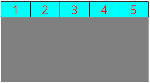
.flex_container {
    background-color: gray;
    width: 60vw;
    height: 60vh;
    display: flex;
    flex-wrap: nowrap;
}
.flex_item {
    border: 1px solid #000;
    width: 15vw;
    height: 15vh;
    line-height: 15vh;
    background-color: aqua;
    font-size: 5vw;
    text-align: center;
    color: red;
}
<div class="flex_container">
<div class="flex_item">1</div>
<div class="flex_item">2</div>
<div class="flex_item">3</div>
<div class="flex_item">4</div>
<div class="flex_item">5</div>
</div>
wrap
자식박스를 표시하기에 부모박스가 작다면, 여러줄에 표시함
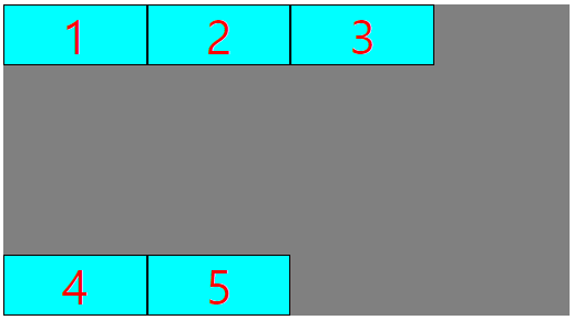
.flex_container {
background-color: gray;
width: 60vw;
height: 60vh;
display: flex;
flex-wrap: wrap;
}
.flex_item {
border: 1px solid #000;
width: 15vw;
height: 15vh;
line-height: 15vh;
background-color: aqua;
font-size: 5vw;
text-align: center;
color: red;
}
<div class="flex_container">
    <div class="flex_item">1</div>
    <div class="flex_item">2</div>
    <div class="flex_item">3</div>
    <div class="flex_item">4</div>
    <div class="flex_item">5</div>
</div>
wrap-reverse
자식박스를 표시하기에 부모박스가 작다면, 여러줄에 표시하고, 아래부터 배치함

.flex_container {
    background-color: gray;
    width: 60vw;
    height: 60vh;
    display: flex;
    flex-wrap: wrap-reverse;
}
.flex_item {
    border: 1px solid #000;
    width: 15vw;
    height: 15vh;
    line-height: 15vh;
    background-color: aqua;
    font-size: 5vw;
    text-align: center;
    color: red;
}
<div class="flex_container">
<div class="flex_item">1</div>
<div class="flex_item">2</div>
<div class="flex_item">3</div>
<div class="flex_item">4</div>
<div class="flex_item">5</div>
</div>
Github
'CSS > CSS_ex' 카테고리의 다른 글
| flexbox : justify-content (0) | 2023.03.11 |
|---|---|
| flexbox : flex-flow (0) | 2023.03.11 |
| flexbox : flex-direction (0) | 2023.03.11 |
| flexbox (0) | 2023.03.11 |
| media query (0) | 2023.03.11 |